

As IoT technology continues to evolve, developers and data scientists are tackling one of the biggest challenges: transforming vast, complex datasets into comprehensible and actionable insights.
With data streaming from countless sensors, visualizing IoT data is essential to detect trends, identify anomalies, and make data-driven decisions quickly.
Let’s explore some practical tips for bringing your IoT and sensor data to life, turning it from raw numbers into powerful visual stories.
Tip 1. Prioritize quality in sensor data collection
Effective IoT sensor data visualization starts with robust, well-structured data collection.
When gathering sensor data, think about what you need to analyze. Are you looking for specific metrics, like temperature trends in an office, or more complex patterns, like detecting machinery anomalies? The quality and scope of your data will directly impact your visualizations.
Tip 2. Select the right IoT data visualization tool
When choosing a visualization tool, focus on compatibility, flexibility, and customizability. Tools like Tableau, Grafana, and other IoT-focused platforms each bring unique features to the table, so it’s important to select one that aligns with your specific data needs and integrates seamlessly with your data sources.
In this guide, we’ll showcase Tableau as an example, but Grafana and other platforms are also highly capable options.
Tableau is particularly powerful for transforming raw IoT data into accessible visual insight. Its capabilities go beyond basic charting, offering dynamic dashboards and in-depth data exploration to track patterns, monitor real-time data, and respond to changes in the field.
Tip 3. Properly connect your sensor data to your data visualization tool
Connecting your sensor data correctly is key for creating accurate and meaningful visualizations. Start by using a reliable data management tool that supports easy integration. With Viam Data, you can capture, store, and sync sensor data across diverse hardware, ensuring it’s ready for visualization when needed.
Follow these steps to configure Viam sensor data for integration with Tableau:
Step 1: Enable cloud sync and data management
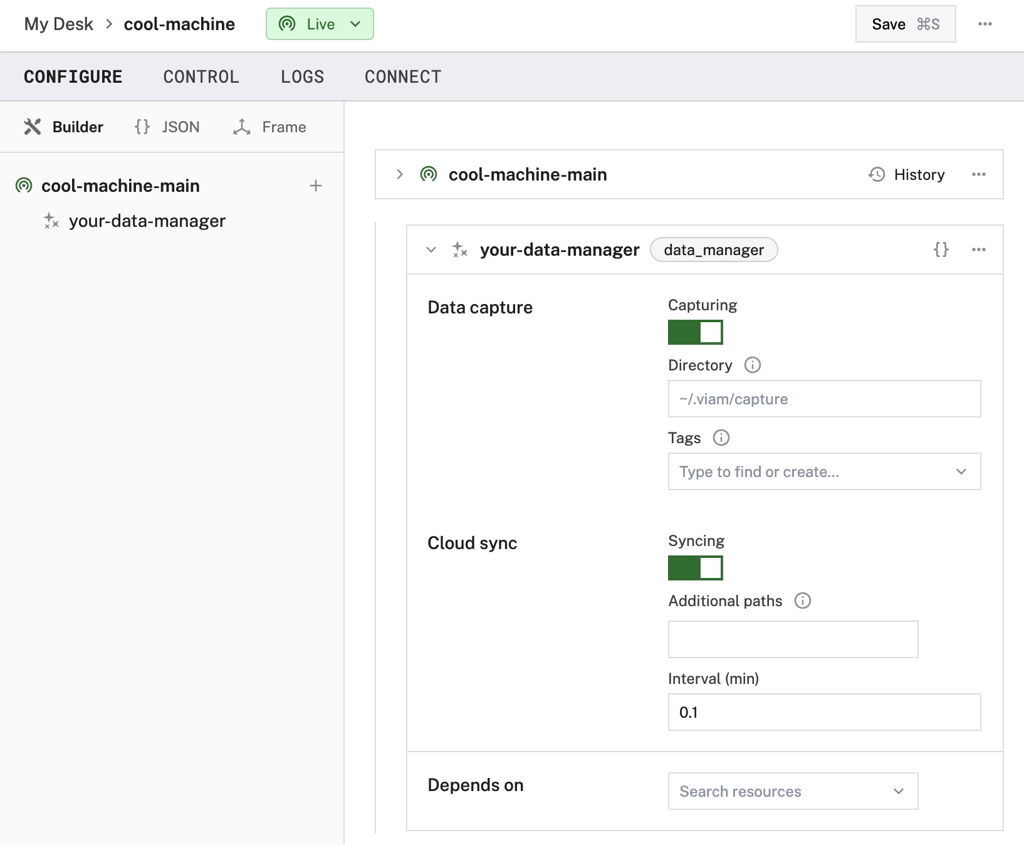
First, make sure all data is stored in Viam’s data management service by enabling data capture.
For the best results, ensure data accuracy and reliability by syncing sensors with Viam’s cloud services. This keeps your datasets comprehensive and up-to-date, so you’re always working with the latest information.
Head to our data capture docs to learn how to do this.
Step 2: Configure database access with Viam CLI
Configure database access for your Organization by using the Viam CLI to set up a new read-only database user for the Viam organization’s data. Using this direct database connection in Tableau enables seamless data importing for your visualization.
You will need to use Tableau for Desktop, instead of the cloud version, to configure the direct database connectivity with the MongoDB Tableau Connector.
Step 3: Set up the MongoDB Tableau connector
First, download the MongoDB JDBC Driver and move the downloaded .jar file into the appropriate directory for your operating system.
Then, download the MongoDB Tableau Connector and move the .taco file to your Tableau ‘Connectors’ folder in the ‘My Tableau Repository’ folder in your documents. This allows the creation of a custom connector that enables Tableau to communicate with the MongoDB Atlas product.
Create a new database connection in the desktop app and search for ‘MongoDB Atlas by MongoDB’ under ‘Installed Connectors’. Authenticate with the connector using the credentials set for your Organization using the Viam CLI.
- MongoDB URI: ‘mongodb://<YOUR DATA FEDERATION HOSTNAME STRING>’
- Database: ‘sensorData’
- Username: ‘db-user-<YOUR ORG ID>
- Password: Whatever password you set when configuring the database.
Step 4: Filter and organize data as needed
You can choose to visualize all your data or filter it to focus on specific machines, sensors, or timeframes, ensuring that only relevant information is displayed in your Tableau.

Tip 4. Structure and prepare your sensor data for visualization
Before diving into visual design, take a moment to structure your data for optimal clarity:
- Group and label data: Organize data by types, such as temperature, motion, or humidity, to make analysis easier.
- Split data into tables: Divide your data into meaningful sub-tables based on sensor type, location, or time period. This will make it easier to visualize specific trends without overwhelming your audience.
- Apply filters for relevance: Focus on key parameters or sensors to refine your dataset and display only what’s necessary, avoiding unnecessary clutter in your visualizations.

Tip 5. Choose visualization types to best represent IoT data
Once the data is imported into Tableau, the next step is to design visualizations that convey meaningful insights. You can consider different visualizations for different types of data interpretation:
Time-series analysis
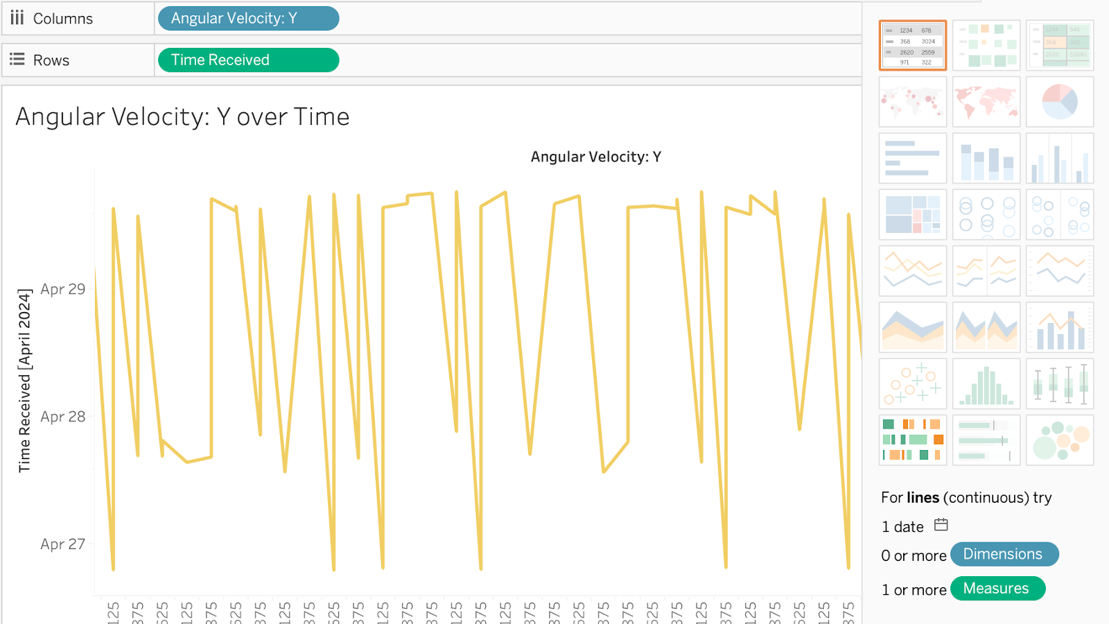
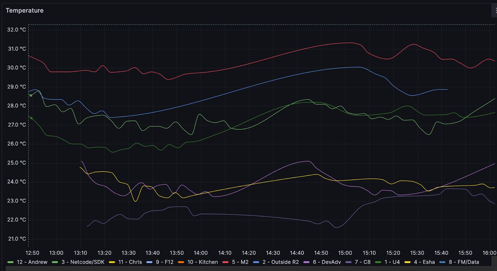
Line charts are the go-to for spotting trends and patterns over time. This is particularly useful for monitoring sensor data such as temperature, humidity, or motion over specific periods.
Interactive dashboards
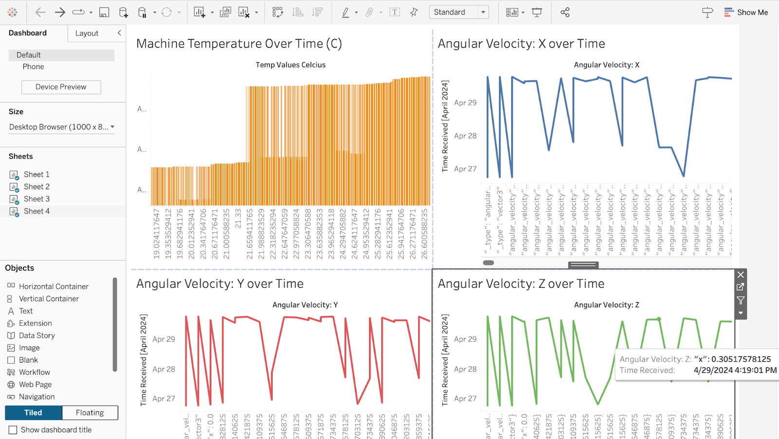
Build interactive dashboards that let users dig into specific data points, apply filters, and see real-time updates. Dashboards can make your data more engaging and help you dive deeper into the analysis at a glance.
Heatmaps and scatter plots

Want to spot correlations and anomalies? Heatmaps and scatter plots can be the answer. A heatmap can show you the intensity of sensor readings across different areas, while a scatter plot might uncover relationships between various sensor data types.
Tip 6. Follow best practices for engaging IoT data visualizations
To maximize the impact of your IoT data visualizations, consider these best practices:
Prioritize simplicity and clarity
Avoid overloading visuals with excessive data. Instead, focus on what’s essential, using clean layouts and labels to make the visual easier to interpret.
Provide context with clear labels
Labels and legends help viewers understand the context of your data, especially if units are complex or vary widely.
Leverage real-time data
Real-time data adds immediate relevance to visualizations, making it easier to respond quickly to operational needs. For instance, you can set up alerts for critical data thresholds within dashboards for instantaneous monitoring.
Thanks to Tableau's live data connections, you can keep an eye on sensor data in real-time, allowing for quick responses to critical changes as your machine is collecting data in the real world.
Start bringing your IoT data to life
Visualizing IoT data is about more than just aesthetics—it’s a practical tool for converting data into decisions. By combining Viam’s data management services with advanced visualization tools like Tableau or Grafana, you can make complex sensor data both accessible and impactful.
Ready to create an IoT data visualization? Start with the tips above or explore step-by-step guidance on visualizing sensor data with Grafana. For more inspiration on leveraging sensor data, check out our post on sensor data for advanced analytics.